Fortunately, I received a lovely goldwork sample set from Hedgehog for my birthday and I have the real deal to compare with. I have picked up a couple of options and going to give them a try. There are three important points to this experiment. First they need to be pretty good approximations for the real deal. I want to re-create a look, so the closer they are to the original, the better. Secondly, they need to play well with fibers. I need to be able to stitch them up without them falling apart, shredding things, or being too finicky to work with. Finally, these substitutions need to wear well. If the metal on them goes a nasty color after a week of use, then it's not good.
I begin my tests with orders from two places:
- French wire from Fire Mountain Gems
- Gold coil cord from Fire Mountain Gems
- Spangles from Crazy Cow Trading Post
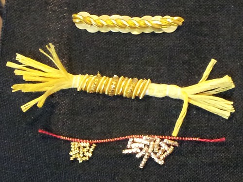 I used my book "A~Z of Goldwork with Silk Embroidery" for instructions and did three rows of test swatches. Row 1 is from page 102. Row 2 is from page 109. Row 3 is some chip work with two different kinds of gold check. The top border of the chip work is a stretched coil wire with red embroidery thread strung through the core (couched down with red thread) to mimic some of the nicer pearl purl effects.
Overall, I'm happy with the test run. The materials aren't as supple as the nice goldwork supplies, but they weren't difficult to work with (beyond the normal challenges of goldwork). I will have to work on my technique, since you can definitely see some unevenness on the row 2 work. The chip work on row 3 would normally be done over yellow felt padding, which makes for a more even sparkly effect. I definitely like the check on the left better than the check on the right. That's not too surprising since the check on the right is super cheap and even has crossed the line into looking cheap. If you needed lots of sparkle, minimal definition, and to cover a lot of ground cheaply, then the stuff on the right would be ok.
Before you go out and spend any money, keep in mind that I have no idea how this will wear. My plan is to do a couple of test swatches and see how they do. One great suggestion I got at Laurel's Prize was to leave a test swatch outside for a week for weathering and try another swatch just sitting in water. If the first test swatch survives my living room, I think it gets at least a few points for durability. As always, there are more detail photos on my Flickr feed, including pictures of the thread packages used in each sample.