Showing posts with label goldwork. Show all posts

Thursday, April 30, 2015

Weaving checks!

Weaving checks
I'm having lots of fun weaving checks!

Weaving with metallics
It was only a matter of time before I rummaged through my collection of metallics. Here is "Artiste" brand gold thread with black crochet cotton.  This was my first project with the Artiste brand gold thread and I really like it.  It's soft and smooth and still has a very nice shine.  I had absolutely no problem with thread shredding.

Weaving with Kreinick Japan gold
Next up was the Japan gold, which turned out lovely.  I wasn't sure how it would hold up, because the thread itself stretches out.  I previously did some fingerloop braiding with it and the metallic loops were unmanageably longer after a while.  I was super careful with the warp tension and fairly delicate with my weaving.  The texture betrays a bit of warp difference on the gold, but the piece will lie flat so it seems an acceptable variation.

Tuesday, March 3, 2015

Finished Byzantine Silk Swatch

Outlining is finished
Above is the entire design, with a Japan gold outline.  I let it sit for a few days and felt it needed a bit more zing.  After rummaging through the gold thread bin, I found some nice twist left over from Giant Sparkly Banner.  I used this twist to add one more round of outlining and it really completed the design.  Hooray!

Finished stitching

Monday, February 23, 2015

Byzantine Silk Swatch

Fill for the leaves are done Starting the outline stitching

I've been stitching along and making progress.  The leaves finished up nicely and although the red isn't as full as I'd like on the stitching, the shiny silk lends some forgiveness.  I used a fat pearl cotton to padd the border stitches and started in on the white.

Satin stitch border is finished

And I finished out the border!  The pearl cotton didn't provide as much loft for the border as I had hoped.  I think that next time I will need a fatter stitch to give a bit more dimensionality.  Just back stitching seemed so fat next to the leaves so I was afraid that a stem or chain stitch would add too much bulk, but I could have added more.  I like the coverage on the border though and the contrasting stitch directions is a nice design element.

Outlining with Japan gold

Here is the start of the shiny gold!  It's finally coming together and starting to look pretty spiffy.  I took an angled photo so show some of the depth that the silk shine adds to the piece.   I've got a Kreinik Japan #7 here for the leaf outline and it has a very complementary shine.  I fiddled with a number of gold options, but the Japan was really what I needed for all those curves and tiny points.  I probably could have gone a teensy bit smaller and used a Japan #5 just because the design is so detailed, but I didn't have any #5 on hand and I am trying to pull supplies from my hoard.  Although the #5 would have been a bit more delicate, the #7 works just fine and really isn't too bulky for the outline.

Monday, February 9, 2015

New thread!


I really wasn't going to start anymore new projects. I've buckled down and focused on knocking things out of my queue with the goals of gulf wars preparations.  But appliqueing a gajillion halberds takes a half a gajillion spools of thread, so I just had to go to Joanne's.  And while I was on task in the thread aisle, this little display lured me in and caught me.

Thread display Thread display, more colors

How could I pass up filament silk at a good price?  I could not.  So, I bought two spools to play with, one in red and one in white.  My intentions were a quick test of the thread so that I could decide if I really liked it.  Once I had the thread it was really soft and shiny and "oh so" pretty!   Also rumbling around in my mind was the desire to make something for a friend.  These two motivations were all I needed as an excuse to have fun in the design phase.  I found something I liked in one of my favorite design books: "Treasury of Byzantine Ornament" by Arne Dehli (published by Dover).

Design pattern Template

Above are a snapshot of the original and my template on tissue paper.


Stitching the pattern outline The stitched outline

Transferring patterns to black fabric is always a challenge.  I am ever the optimist - feeling that one day I will find a transfer method that make me happy.  The truth is that the process is fiddly no matter what the approach.  This time I chose to pre-stitch the outline from a tissue paper template.  This method is popular with a lot of fine embroidery enthusiasts, especially on dark fabrics or fabrics that won't or shouldn't take a pen or chalk or other potentially messy options.

I shouldn't have used the silk on this step.  It was so smooth that the template really didn't want to come off and the stitches got pulled around too much.  After a bit of coaxing and pulling some of the stitches from the back, it finally looked good again.


Stitching progress

And here is the first bit of stitching.  I'm doing laid work in the red with gold highlights for the couching.  The gold approximately matches the detail lines from the original drawing.  The filament silk is very shiny and as fiddly as filament silk is expected to be, but not really more.  I'm planning on a slighly thicker gold for outlines and the border in white.

I hate progress pictures at this point.  The silk is still a bit wonky.  The couching is freshly done.  The outline isn't in yet.  The whole thing is just "off."  I share them with you, my dear readers, because those who truly inspired me do the same.  Pretty things don't start pretty.  There is a magic point along the way where it all blends together and starts to look nice.  Sometimes it doesn't actually blend and those projects are educational as well.  I don't think I would have been brave enough to try some of the techniques that I've seen in project blogs if people didn't share these "in between" progress pictures.  In that spirit, here are mine.  I hope this one works.

(With that little aside, the red is lucious and the gold is sparkly, and distances are most forgiving - so I am optimistic)

Tuesday, July 29, 2014

Populace banners

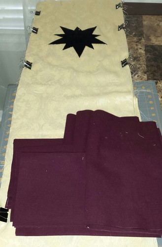
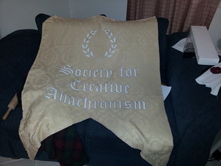
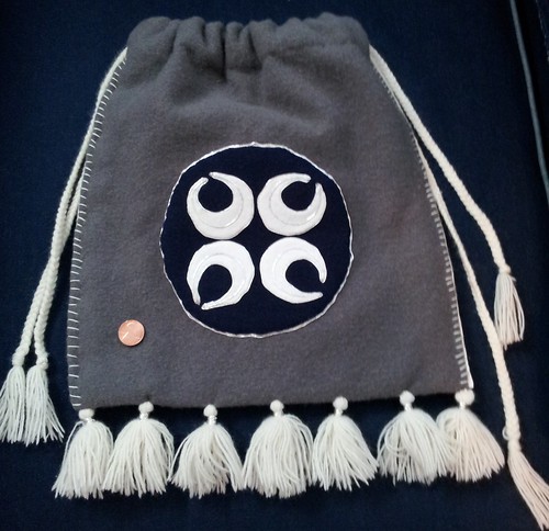
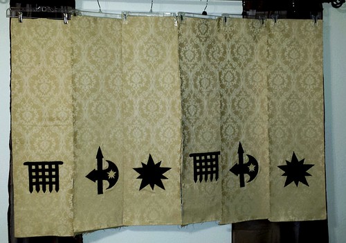
I've been on a banner kick lately and I had some left over brocade, so I decided that Giant Sparkly Banner needed some friends. The project was born and I am working on six populace banners - two each for Ansteorra (kingdom), Bryn Gwlad (Barony), and for Hellsgate (shire with Bryn Gwlad). These little banners have been moved around my house stacks several times in various states of completion, but finally I got a picture of all of them together. Last night I finished backing them all with canvas and now all I have left is gobs of hand sewing to roll the hems and close out the raw edges. Anyway, here they are, starting to look fairly spiffy! Stitching is finished and all the banners are backed.   Next is finishing hems and hangers.

Production on these was fairly simplified since I was aiming to actually finish them this year. I wanted a look that would complement Giant Sparkly Banner, but they aren't competition pieces, so bring on the sewing machine and quilter's hacks! The black is a sturdy cotton velvet with a very short pile. It's a very pretty velvet, but it's best feature is that a test swatch passed the ironing test - on high heat. That means I can do all sorts of fun things with it.

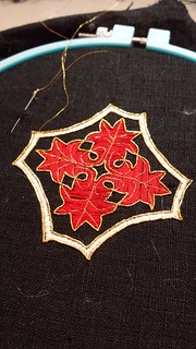
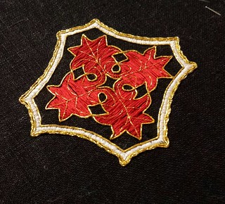
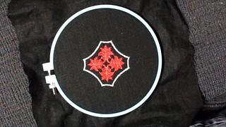
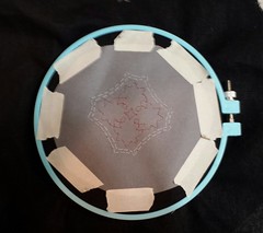
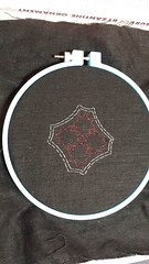
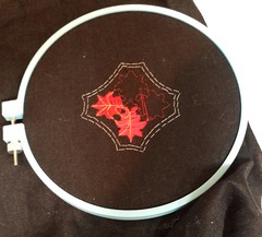
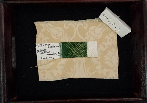
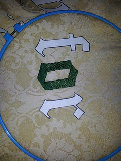
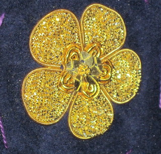
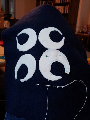
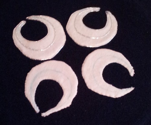
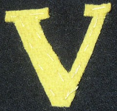
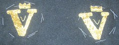
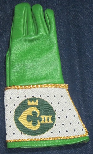
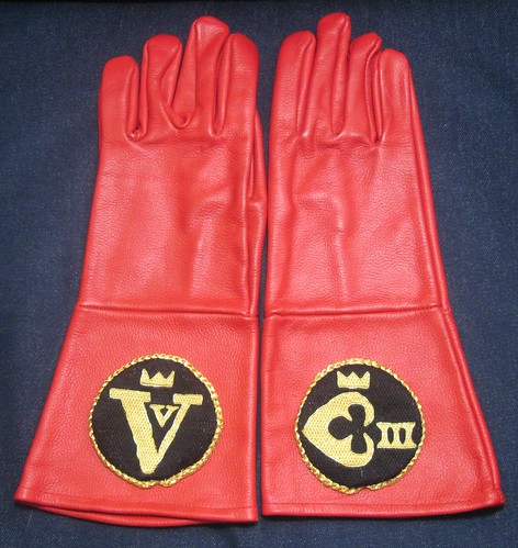
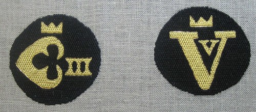
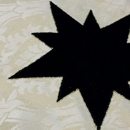
First, I fused a tear-away stabilizer to the back of the brocade. The brocade is pretty, but it would never hold up to the abuse I was about to heap out without some help. I cut out the and fused the velvet charges to the brocade using Heat-N-Bond. I wanted something that could pass for hand embroidery at a distance, so skipped the traditional fusible+satin stitch option. My machine has a nice blanket stitch option, so I used a narrow blanket stitch and stitched down the edges for each of the charges. Populace banners

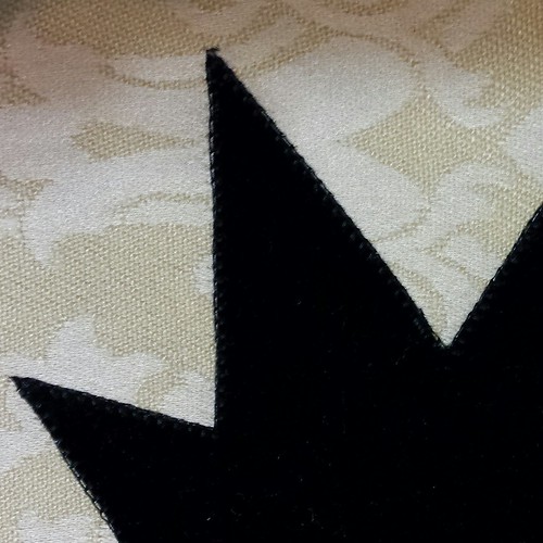
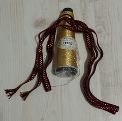
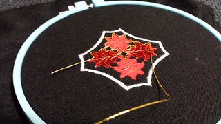
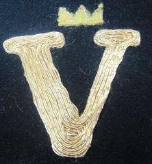
Any banner that is going to sit next to Giant Sparkly Banner is going to need a little pizazz, so I dug out my left over gold twist. I couched the gold twist around all of the edges by hand, on top of the blanket stitch. The result is nice. The gold twist makes a nice contrast border for the velvet and adds some sparkle, while also covering up any stray machine stitching that wasn't exactly flush with the edge of the charges. Populace banners

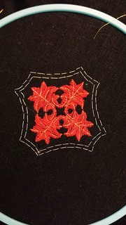
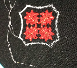
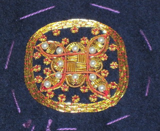
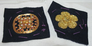
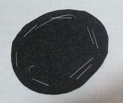
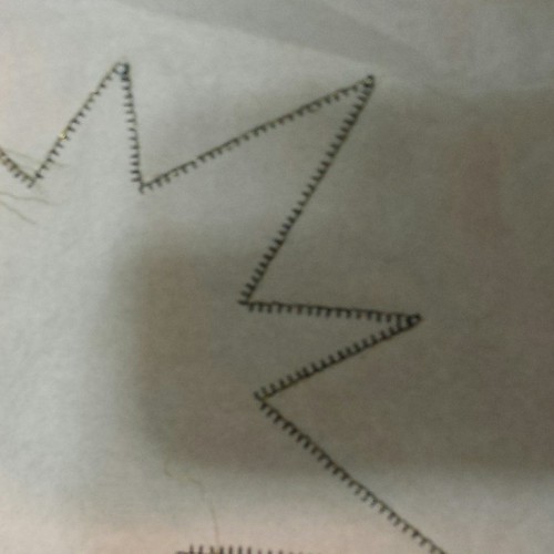
I left the fused stabilizer on the back, which made the stitching for the couching quick work. I didn't need a hoop or frame, since my tension was perfect. The lightweight tear-away stabilizer didn't hamper my the needle work at all. Below you can see the back of the pieces with visible machine work in black and hand work in gold. Populace banners

Overall, this was a great approach to get maximum bang for my time. I started to feel like the project was dragging, but then realized that there were six of these things! After the embroidery was all finished, I ironed out the pieces, squared them off, and cut the canvas backing. This part was all classic quilter's skills, except I had a stack of brocade, which is less cooperative than quilter's cottons. Again, I found that you can never have too many binder clips and there is always a use for more. After taming the wild brocade and squaring things off I managed to actually hit my target of a width of 12 inches for the banners (although some of my hems will be very small). In another stunning development, when I finally hung them up, the charges are all lined up correctly. I kind of held my breath on that one, because no matter how much you plan and check and re-check you always fear that something weird would happen. Will one be out of vertical alignement? horizontal alignment? upside down? I kind of just stood there and stared for a bit when they turned out just fine. Hooray! Squaring off the brocade and cutting the canvas backing.

Sunday, March 23, 2014

Giant Sparkly Banner on Tour

KingdomAnS-109

KingdomAnS-110

Giant Sparkly Banner made a trip to Kingdom A&S and to Bryn Gwlad A&S competitions. Above are pictures of it in action. Below is a picture of the banner completed getting ready to go traveling.

banner

My display used two trays: one for materials and one for technique. The materials tray contained my tools including scissors, needles (in the needlebook), and a laying tool. I made skeins with the threads I used in the green, the passing gold, and the gold twist. Finally, I included a sample of the gold twist lucet cord, which I stored on a thread winder.

tray 2

The second tray displayed the various steps for the embroidery. The two fill patters were embroidered in a series of steps

  1. Foundation: The foundation layer is the white interface foundation which was cut to design and ironed on the brocade. In the sample the white layer is shown at either end of the swatch.
  2. Laid green stitching: The green threads were laid down for full coverage of the foundation. The stitch length for the green thread is much longer than most embroidery stitches because it will be couched down later. You can see in the picture that the green thread drifts and wiggles where there are no layers above it.
  3. Laid gold stitching: The next layer was gold passing thread embroidered in laid work pattern, which was on top of the green embroidery. The letters were embroidered in open laid work using a grid pattern. The leaves of the wreath was patterned after Gabriel's wings from an alter frontal so the only laid work was the single gold twist thread along the center. The top half of the sample shows the laid gold threads before they are couched. There is still some shifting of the gold and green threads and the sheen is at a uniform angle.
  4. Couching:After the laid work is finished, the gold pattern (grid or wing/leaf) was couched down. For the grid pattern on the letters, each intersection is couched with a single stitch of gold passing thread. For the wing pattern on the leaves of the wreath, the center gold twist is couched with a longer stitch at an acute angle. The leaves have fewer couching stitches, but the stitches are longer and cover more of the green thread. The bottom half of the stitching in the sample shows the grid with the intersection couched down. The couched intersection gives the work a more dimensional look which adds more sparkle. On the far right end of the swatch you can see the grid couched down without the green layer, to show the couching stitches more clearly.
  5. Outline: The final step for each embroidered motif was to add an outline of couched gold twist. The sample shows the gold twist couched on the bottom of the foundation layer. On the right side of the swatch, the end of the twist has been plunged (pulled through the brocade) as is normally done on finished embroidery. This is a good example of why the foundation and brocade combination work so well. The foundation provides stability for the couching stitches, which the looser weave of the brocade allows the much thicker gold twist to be pulled through to the back without creating tears or runs in the weave. The left side of the swatch shows the gold twist left loose on the top, which is what it looks like while it is being couched. You can immediately see that the biggest challenge here is holding the thread in place for stitching, while trying to keep the twist and prevent fraying of the top threads.

tray 1

Thursday, March 13, 2014

Lucet cord edging

I finished the Giant Sparkly Banner a while back, but still need to finish posting progress pictures. Here's a short summary of how I finished the edges using lucet cord. First I prepared the seam by turning in the edges, pinning them, and ironing them flat. Here is a picture of the stitching in progress so that you can see the front layer (the yellow brocade), the back layer (the blue linen), and the gold lucet cord.

Use the first stitch to pick of both pieces of fabric along the folded edges.

The second stitch then goes throughout the middle of the lucet cord. When you pull tight it will close the seam with the cord on top.

I stitched the edges closed with my gold Gutterman thread and they edges look very nice. It's a very simple medieval period technique to decorate edge seams.

Above is an example of a pouch with braids along for seam finishing. The braids on this one look like finger loop braiding. Dutch circa 1617/1622

Above is another good example - Dutch?/Italian? cir cal 1580+

Tuesday, October 15, 2013

Giant Banner Progress Pics

Giant banner progress

I was out sick last week, so I missed quite a few days of stitching. Bah! Anyway, I started feeling better this weekend and have resumed stitching. One row down, two to go! I fear that the pictures really don't do it justice - the couched gold is very, very sparkly.

I was chatting about the banner this weekend and this project has been really interesting for a couple of reasons. The first big surprise was the depth you get from just one piece of paper for the letters. The first layer of each letter is laid green thread (just DMC cotton floss). The single layer of paper adds a surprising amount of dimensionality to the stitching. I suppose it makes sense when you look at the perspective of the actual thickness of the thread. I just hadn't really realized how much you could get out of so little.

The second layer is the laid criss-cross of gold thread. I am using a gold Gutterman machine embroidery thread for durability/washability/cost/etc. It's a very smooth thread and very nice to work with. Finally, I couch down the criss-cross at the intersections, which adds the texture and sparkle. It's very satisfying to finish a letter and see it glitter.

Monday, September 30, 2013

Giant banner

Starting a banner

We have a demo coming up soon that will be hosted at a local museum, so I wanted to make a Really Nice banner. I've been futzing around with the design for a while now and finally called it good this weekend. Due to a slight clerical error said banner is the size of my couch. Ahh, re-size by height or width - does it really matter? (Yes) Anyway, I got it all laid out and the design transferred and took a minute to bask in my success. All the letters in a tidy row. I was itching to get started, but only had just a few minutes after dinner last night to actually start on the stitching. Below is a picture of the first stitching - laid green thread with gold couching. It sparkles! I love the fill, now I have to figure out what I'm going to outline with. Somewhere in the fussy planning over the last couple of weeks I have this hazy idea of a fringe and that the outline will match the fringe. Ahh well, I have a lot of fill stitching ahead, so it's not an immediate crisis.

Beginning the stitching on giant banner

Wednesday, July 10, 2013

Gold Work Doodle #2

Goldwork doodle #2 My second doodle is finished! I used red couching thread on this one and mixed in some bezants and pearls, resulting in a very different look. I was going for a more Byzantine style and design on this one and I like how it turned out. The main downside to the "doodle" approach to trying out new stuff is that this doodle looks very hand drawn (which it was, in various stages). My modern aesthetic balks at imperfect geometry, but I console myself with the thought that it does look more like the stuff I see in museums.

I thought I'd include a picture of the two doodles, side by side. They are essentially the same basic gold work supplies and same ground fabric - what a different appearance! Comparision on #1 and #2

Friday, July 5, 2013

Gold work doodle #1

Goldwork Doodle #1 I've finally started playing around more with my faux (cheap) gold work kit that I put together a while back. I've been wanting to do something more than the little sample swatches I put together before. I have mounted a few bits of wool on the frame and without much planning or fanfare, begun to doodle. The first bit turned out to be a rose, which is about 1.5 inches in diameter. I like the results and have improved my skills substantially. At some point I realized that I had accidentally committed myself to quite a bit more chip work than I wanted, but I stayed the course. It's hard to see, but the petals are padded and have a sloped, bubble effect for surprisingly nice dimensional effects (for a first try). I've used up all the check in that size, but the results have amazing sparkle. I think I would like to display it in a dark closet with one candle for the "oooh" effect!

Saturday, September 1, 2012

Cheap goldwork?

I've been itching to try some goldwork embroidery for quite some time, but can't bring myself to spend that much money on supplies. I am a huge fan of Good supplies and am happy to spend my money at places like Hedgehog Handworks for quality stuff. However, most of the goldwork embroidery market is ecclesiastical embroidery, where they have a budget to allocate for real gold. I'm more interested in playing around with stuff and will likely making some stuff for SCA that will go camping. In this case, it doesn't *have* to be real gold, just look nice. Thus began my quest to find cheaper alternatives.

Fortunately, I received a lovely goldwork sample set from Hedgehog for my birthday and I have the real deal to compare with. I have picked up a couple of options and going to give them a try. There are three important points to this experiment. First they need to be pretty good approximations for the real deal. I want to re-create a look, so the closer they are to the original, the better. Secondly, they need to play well with fibers. I need to be able to stitch them up without them falling apart, shredding things, or being too finicky to work with. Finally, these substitutions need to wear well. If the metal on them goes a nasty color after a week of use, then it's not good.

I begin my tests with orders from two places: Here is the first stitching test result: goldwork-test I used my book "A~Z of Goldwork with Silk Embroidery" for instructions and did three rows of test swatches. Row 1 is from page 102. Row 2 is from page 109. Row 3 is some chip work with two different kinds of gold check. The top border of the chip work is a stretched coil wire with red embroidery thread strung through the core (couched down with red thread) to mimic some of the nicer pearl purl effects.

Overall, I'm happy with the test run. The materials aren't as supple as the nice goldwork supplies, but they weren't difficult to work with (beyond the normal challenges of goldwork). I will have to work on my technique, since you can definitely see some unevenness on the row 2 work. The chip work on row 3 would normally be done over yellow felt padding, which makes for a more even sparkly effect. I definitely like the check on the left better than the check on the right. That's not too surprising since the check on the right is super cheap and even has crossed the line into looking cheap. If you needed lots of sparkle, minimal definition, and to cover a lot of ground cheaply, then the stuff on the right would be ok.

Before you go out and spend any money, keep in mind that I have no idea how this will wear. My plan is to do a couple of test swatches and see how they do. One great suggestion I got at Laurel's Prize was to leave a test swatch outside for a week for weathering and try another swatch just sitting in water. If the first test swatch survives my living room, I think it gets at least a few points for durability. As always, there are more detail photos on my Flickr feed, including pictures of the thread packages used in each sample.

Monday, July 16, 2012

Largesse for Pennsic Finished!

Ta-da! Finished! progress5 There are more progress pics on my Flickr stream, but since I was too lazy to blog them in progress - I will spare you. I put the penny on top for scale, since it's a fairly large pouch. Final materials list:
  • wool - gray pouch, blue roundel
  • white linen - white crescents and pouch lining
  • Kreinik Jap 5 silver thread for couching and tassel tops
  • Gutterman silk white sewing thread
  • a lace weight white wool yarn for drawstring and tassels

Monday, July 9, 2012

Largesse for Penssic

I thought I'd post some of the progress pics on the little project I'm doing for our gift basket at Pennsic. I've been meaning to try some needle-turn applique, so this is my test project. The background is some blue wool I picked up at Gulf Wars and the crescents are a nice dense weave linen. I used the linen both as the applique and the foundation, since I didn't have any thin white wool. Below is a progress pic of the applique. progress-b The linen foundation gave more loft than I thought it would, so the crescents have a nice depth. After the applique was finished, I started with the outlining. progress-a The outlining is done in Kreinik Jap 5, couched with silk thread. I like the way they are turning out, though the applique acquired some skew. I starched the foundation linen, but alas, it was a crescent with lots of bias edges, so skew was probably inevitable no matter how well I tacked it down before the applique - lesson learned. The outlining smooths things out quite a bit and adds some forgiveness to the process. The camera doesn't really capture the wool / linen / silver contrast very well, but I am pleased with the look. More progress soon, since I'm on a deadline.

Sunday, May 15, 2011

Gloves: Goldwork progress pictures

Here are my pictures from the goldwork progress on the gloves I posted about earlier. The materials are a woven wool background with a muslin backing, wool felt for foundation padding, Kreinik Japan Gold #7, and Soie Crystal silk for couching.

IMG_1227
I used yellow wool felt for the foundation. Here is a progress of tacking it down.

IMG_1233
The foundation is completely sewn down and I have started couching the gold thread.

IMG_1236
More progress

IMG_1238
The "V" is finished and I have started the crown.


IMG_1245
Finished embroidery for both gloves

IMG_1248
I used a dark gray wool foundation under the embroidery to give it a bit of lift off of the glove. Here are the circles basted on.

IMG_1250
Front picture of basting.

After I based the circles down, I cut the fabric with a nice seam allowance and gathered it around the circles. I used a tiny drill bit to drill holes in the gloves and an awl to sew down the roundels. Next I made the gold braids out of the Krenick gold. Finally, Rachel and I sewed on the gold braid trim around the edges. Its at a slight angle to cover the depth difference between the glove bottom and the roundel top.

Overall this was a fun project. It was the first time I've used the foundation padding for more depth in the embroidery and it really does make it sparkle! Its a bit harder to work with and the precision/tightness of the couching was harder to get. Its hard to see in the picture but there is a bit of texture in the couching on the crowns that added a little sparkle. I liked the minimalist little "v" when I did the embroidery (especially in contrast to the depth of the big "V"), but now I'm kind of wishing that I had done something fancier. Ah well, that's life.

The Kreink Japan gold is fun to work with (and I have several large spools of it!) but I am looking forward to trying some of my real metal threads soon - just as soon as I can figure out the project!

Friday, May 13, 2011

More Gloves!

I've been remiss in posting, but here is the current state of things. Pictures are included of the three gloves that I have completed for the crown. After I finished the stitching, Rachel came by and helped with the construction and finishing which speeded things along. I'll do some more posts that show construction updates, but I couldn't resist posting the finished gloves. The pictures don't really capture the shine of the silk or the sparkle on the gold (especially the highlights on the Queen's glove).

King's Gloves: These are padded goldwork on a woven wool foundation. I used wool felt for the padding to give it a bit of dimension.
King's Gloves

Queen's Glove (Front)
Queen's glove (front)

Queen's Glove (Back)
Queen's glove (back)

Monday, February 7, 2011

Gloves #1 are finished!

Royal's Gloves I


I have finished the first pair of royal gloves for Their Stellar Majesties Ulsted the Unsteady and Ebergardis von Zell. The stitching is done in German Brickwork and is Rainbow Gallery Splendor silk on linen, with Kreinik Japan Gold #7 couched as outlines. I sewed the stitched roundels onto the gloves using a leather awl and the trim is braided Kreinik Japan Gold #7. The gloves were delivered at Bryn Gwlad's Candlemas event.

Details:

Since I was attaching the stitched roundels to leather gloves, I rummaged through my toolbox and found my leather awl. It was definitely the right way to go, especially since the gloves were already put together and I had to reach inside them. The German brickwork stitching has a lot of body when finished, which makes for a really thick finished piece. Even with some tight stitching on the edges I found that I needed a thick trim to keep the edge from being too abrupt.

I tried several different approaches to the trim. I think that finger loop braiding can make really nice trim, so I tried a few different patterns and discovered that Japan gold is terrible for finger loop braiding. It doesn't hold tension well, stretches unevenly, and doesn't flex gracefully - so you end up with a chunky mess that glitters. I was going for something a bit more elegant than that so I tried several flat braids. The final winner was a three strand flat braid with 6 pieces of Japan gold per strand - 18 total strands. The result was a smooth trim which (with some fiddling) I got to lay at a (mostly) 45 degree angle to smooth the chunky edges.

Royal's Gloves I